Tawny Coster - Again

Next

Previous 

Details


Ganesh H Shankar
Tawny Coster - Again
Which one works better for you ? This one or or this ?
Sat Sep 17, 2011 7:22 pm
1207
Ganesh H Shankar's CNP Gallery       |      Send PM to Ganesh H Shankar     |       [NEW] Recent Comments by Ganesh H Shankar

--
Ganesh H. Shankar
Wishing you best light,

Image
Fine Art Nature Photography


Ganesh H Shankar  Joined CNP On 24 Apr 2008    Total Image posts 973    -   Total Image Comments 7904    -   Image Post to Comment Ratio 1:8    -   Image Comment Density 38     -     Total Forum Posts 956

Rating & SHARING


8
Login to rate this image

Post a comment


Comments

Commentby Saurabh Sawant on Sat Sep 17, 2011 7:29 pm

This one works better for me. Superb.

Commentby AratiRao on Sat Sep 17, 2011 8:22 pm

This one works better for me ganesh, hands down. The moody sky and the pen-sketch-like strokes of grass on the right corner all come together in the angle you've shot it at. it's the element of surprise in the color of the tawny coster that completes the interest in the image for me.

--
~ Arati Rao ~
http://www.aratirao.com


» Last edited by AratiRao on Sat Sep 17, 2011 8:23 pm; edited 1 time in total

Commentby Adithya Biloor on Sat Sep 17, 2011 9:45 pm

Yes, to me also this works better. However not sure about the inclusion of the sun.

--
Regards,
Adithya Biloor
www.lensandtales.com

Commentby Nilanjan Das on Sat Sep 17, 2011 11:30 pm

I love the inclusion of the sun Ganesh, surely this one, no questions asked :-). Frankly buddy, for the other one I was wondering why did you post it ? You have made thousands of such images in the past and you know everything about how to control the DOF, the shooting angles etc, so those experiments were already over. Knowing you, I know you try something wonderful every time you are out there, something different, but I can think of many images of yours posted in the past which can be compared to the other frame. Here in this image, there are so many things to control, photographically, as well as conceptually. There is more and surely you had to keep in mind the sun does not burn the image, the grass does not over fill, the right amount of details on the butterfly as well as the overall impact by keeping the morning mood intact. This is just perfect and not only that though it may look simple and easy, I think I know what it takes to create something like this :-). Brilliant one.

--
Nilanjan Das Photography

Commentby Radha on Sun Sep 18, 2011 12:03 am

Ganesh, definitely this one, for me :)
The neutral tones and the grass make all the difference, the tawny coster stands out in contrast..

--
Radha Rangarajan
My Blog ~ Flickr

Commentby Nevil Zaveri on Sun Sep 18, 2011 12:26 am

this one, ganesh. like the mood 'n subtle play of light, here.

regards.

--
Image
http://www.nevilzaveri.com/

Commentby Ganesh H Shankar on Sun Sep 18, 2011 7:36 am

Thanks friends for you views !

Nilanjan, personally I too prefer this over the other one. I kind of liked the other one for its colors against the blue sky - probably as Jayesh said, like colorful kite in the sky. But I was not happy with technical shortcomings of that image.

Adithya, I could manage just two more images before it flew off. Here is one with sun away.

Image

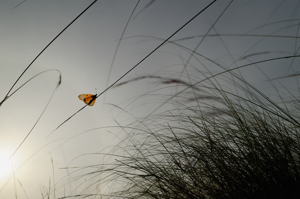
May be this one can be cropped slightly to exclude the sun. Personally I prefer the top one to this. I think excluding the sun simplifies the composition
but takes out an interesting element out too ( this is similar to my comment on Arati's latest post - the role of tree at the bottom right).
I thought sun as an element in the frame gels well with the morning mood than bringing in additional competing visual element with the butterfly.
Just my thoughts - these are all subjective preferences. Nothing is right or wrong but always helpful to know others thoughts.

I was keen to have a perspective from the bush but it was very busy and flew off :)

Note : For those who wonder how to show an image here you may read the the topic on adding signature here. At the end you see a note on how to add an image.
For this to work you need to have the image in your own website and then provide a link to it here. Alternatively when you have multiple images to share and discuss
(or you don't want to understand BB Codes etc) Illustration forum is the better choice.

--
Ganesh H. Shankar
Wishing you best light,

Image
Fine Art Nature Photography


» Last edited by Ganesh H Shankar on Sun Sep 18, 2011 7:49 am; edited 5 times in total

Commentby Rajkumar on Sun Sep 18, 2011 8:30 pm

Hi, Love this top one to all else. This is a wonderful a series and style. Almost like a ants POV The almost monchrome tones of the rest of the frame contrasts well. The strokes of grass gives life but death also lurks in the same grass. I get that what will happen next feeling

--
Art is about what is inside rather than what is outside


» Last edited by Rajkumar on Sun Sep 18, 2011 8:31 pm; edited 1 time in total

Commentby Prashanth Sampagar on Sun Sep 18, 2011 9:09 pm

What a lovely composition this is, Ganesh Sir! For me this version looks better. I second Aditya's view on inclusion of the sun. I just tried square crop on this. I've posted it in illustration forum. viewtopic.php?f=9&t=445
Appreciate your view on this.

--
Prashanth Sampagar

My Insta feed

Commentby jayesh joshi on Sun Sep 18, 2011 10:55 pm

Both ! Previous one for simplicity & this one for complexity ....

Commentby Vijay Mohan Raj on Mon Sep 19, 2011 6:54 am

Ganesh, I agree that this one stands outs in terms of uniqueness, but the other one is also a fine example of wide macroscape. Normally we tend to shoot within our photographic understandings, but sometimes the broader appeal of the image should also be kept in mind. The previous image has much more broader appeal and this one will certainly be preferred by photographers. What sets this both images apart is the extraordinary angle and compostion of seeing the macroworld from bottom-top rather than normally seen top-bottom.

--
A creative mind is a restless soul...

Commentby Adithya Biloor on Tue Sep 20, 2011 2:41 pm

Ganesh, yes, a perspective from the bush would have been very nice. I was expecting that from you. But as you say, easier said than done. Btw, I like this one very much
http://www.naturelyrics.com/galleries/n ... grass.html

--
Regards,
Adithya Biloor
www.lensandtales.com