We often suggest changes to posted images. If we want to take some time to illustrate the changes then users can post and discuss the the changed image here. PLEASE TAKE CONSENT FROM THE POSTER BEFORE YOU DOWNLOAD/EDIT OtHERS' IMAGES. Please keep files sizes small - preferablly less than 650pixels on longer side.
Moderators: Prashanth Sampagar, Raviprakash S S, Adithya Biloor, Nevil Zaveri, Aniket R Thopate, Adithya U N, Sarthak Agrawal
 by Pramod Viswanath » Mon Apr 23, 2012 7:53 pm
Here is the B&W Version of the image
- Attachments
-
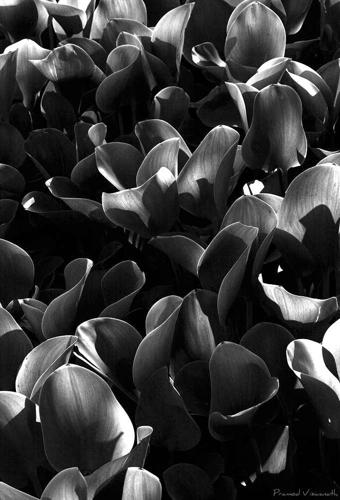
- _MG_5146_Pramod_FromTheOblivions_BW.jpg (320 KiB) Viewed 5974 times
-
Pramod Viswanath
-
- Posts: 118
- Joined: Thu Apr 24, 2008 10:22 pm
- Location: Bangalore, Karnataka, India
-
by Ganesh H Shankar » Mon Apr 23, 2012 9:23 pm
Works much better for my taste buds !
-

Ganesh H Shankar
- Site Admin
-
- Posts: 1143
- Joined: Thu Apr 24, 2008 6:54 pm
- Location: Bangalore, INDIA
-
by dinesh.ramarao » Tue Apr 24, 2012 8:50 am
Works for me too, opening shadows a bit and 2% purple tinge would be my choice.
-RD
- RD
-
dinesh.ramarao
-
- Posts: 76
- Joined: Wed Sep 10, 2008 9:40 am
- Location: Bangalore
by Shivakumar L Narayan » Wed Apr 25, 2012 9:59 am
I think i will go with the B&W version ... the greens in the color version is more of blending with the contrasty setting. But the B&W has a nice 3d feel to it.
Probably a bit of toning down of the highlights in few regions and lifting up the shadows will do more wonders.
-
Shivakumar L Narayan
-
- Posts: 131
- Joined: Thu Apr 24, 2008 10:00 pm
- Location: Bangalore, India
-
Return to Illustration Forum
Who is online
Users browsing this forum: No registered users and 24 guests

