We often suggest changes to posted images. If we want to take some time to illustrate the changes then users can post and discuss the the changed image here. PLEASE TAKE CONSENT FROM THE POSTER BEFORE YOU DOWNLOAD/EDIT OtHERS' IMAGES. Please keep files sizes small - preferablly less than 650pixels on longer side.
Moderators: Prashanth Sampagar, Raviprakash S S, Adithya Biloor, Nevil Zaveri, Aniket R Thopate, Adithya U N, Sarthak Agrawal
 by Manjunath » Thu May 10, 2012 8:21 am
Nirlep and others, thanks for your suggestions.. here's another perspective..
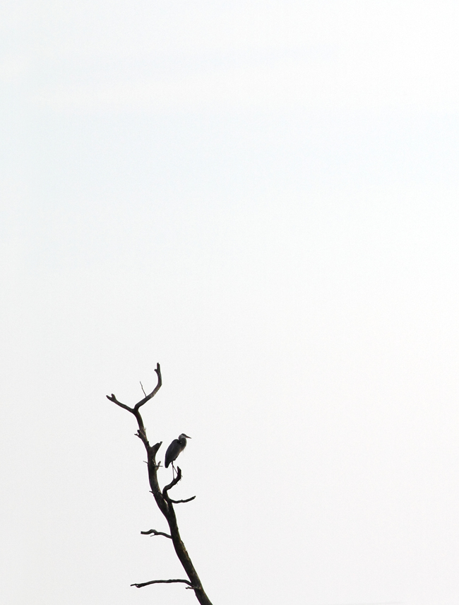
- f_pton_IMG_1588_blend2.jpg (240.36 KiB) Viewed 4418 times
vertical composition, with lesser contrast and different position of the bird..

original posting
-
Manjunath
-
- Posts: 6
- Joined: Sun Sep 21, 2008 12:57 am
-
by sriram janak » Thu May 10, 2012 9:24 am
this surely looks better...
-
sriram janak
-
- Posts: 3
- Joined: Sun Sep 18, 2011 1:38 pm
by Shivakumar L Narayan » Thu May 10, 2012 11:09 pm
The vertical frame really works very well for my type of taste. From what i have seen and experienced whilst shooting minimalistic images, its very tough to keep the subject small yet still balance the frame in the image. the colors or the graphics or the action in the image should make up the composition strong.
Thanks for sharing your perspectives here.
-
Shivakumar L Narayan
-
- Posts: 131
- Joined: Thu Apr 24, 2008 10:00 pm
- Location: Bangalore, India
-
Return to Illustration Forum
Who is online
Users browsing this forum: No registered users and 3 guests
